
Why print-route decisions matter to hardware buyers
When private-label buyers compare carton printing spot color versus CMYK Pantone proof, the real decision is how the approved brand color will be reproduced on the actual packaging material using the supplier’s chosen print route. A color reference by itself does not define the complete result. Artwork, substrate shade, coating or lamination, print method, proof type, viewing conditions and production variation all influence what a buyer sees on a finished carton.
For bathroom and home-storage hardware, cartons protect a metal product while carrying the importer’s brand, model information and handling details. A color mismatch may be most visible on a logo or a large solid panel; it may matter less on a small illustration or multi-color photo. Buyers should identify which colors and package areas are commercially important before deciding whether a spot ink or a process-color build is appropriate.
This guide is a procurement and proof-approval framework, not a universal color-management specification. A Pantone reference can support communication, but it does not guarantee an exact visual match across every substrate, print press or finishing process. The buyer and packaging supplier must define the production material and the approval sample that represents the order.
Understand the two color approaches
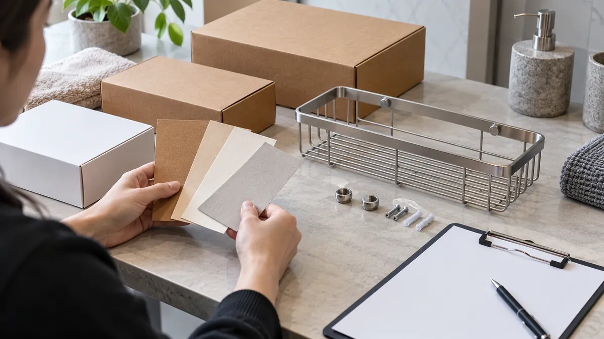
CMYK process printing builds colors from cyan, magenta, yellow and black inks. It is often used for multi-color artwork, images and designs that contain many colors. A particular brand color may be represented by a CMYK recipe, but the visual result depends on the printing conditions and material. A digital preview or screen rendering is not the same as a press sample on the carton stock.
A spot color uses a separately specified ink intended to reproduce a selected color. Buyers may use a named color reference such as a Pantone code to communicate an expectation. The printed result still depends on substrate, ink formulation, opacity, print sequence and finishing. A reference book viewed under one light and a carton seen under another can appear different.
Neither route is automatically superior for every packaging job. The decision should reflect the artwork, number of colors, desired repeatability, print supplier’s process, order economics and buyer’s acceptance needs. Ask the packaging supplier to recommend a route and explain its limitations on the actual board. If a brand color is critical, request a physical proof on the proposed stock before approving production.
Decide what must match and what may vary
Review the artwork and identify critical color areas: logo, large brand panel, product-category color, warning or product identification. Distinguish these from photographs, gradients, decorative patterns and low-priority background colors. A small spot-color logo on a mostly photographic carton may call for a different review than a full package built from a limited palette.
State the color reference and the proof condition. If the package includes a coated or laminated surface, clarify whether the approved reference is viewed before or after that finish. A varnish, gloss coating or film can alter the appearance. Similarly, brown, white or recycled board can change the perceived color compared with a white proof paper. The intended substrate should be part of the approval conversation.
Do not write “match Pantone exactly” without describing the proof and production condition. The buyer should indicate the approved source reference, the physical proof selected for production, the package material and any agreed tolerance or visual acceptance method. If a numeric color measurement is required, specify the instrument and viewing setup with a qualified packaging supplier; do not invent a universal value in a generic purchase note. Include the carton’s exposed faces and fold lines in the review, since a large color area may wrap around a corner or terminate beside an unprinted panel. Agree whether any color variation at seams or glue areas is acceptable before the finished sample is approved.
Compare spot and process print for the project
| Buyer factor | Spot-color route | CMYK process route | Question to resolve |
|---|---|---|---|
| Artwork | Often suited to a limited, defined palette | Useful for images and multi-color artwork | Which areas are brand-critical? |
| Color reference | May use a named ink/reference for a selected color | Uses a process build to approximate a target | What physical proof represents the order? |
| Substrate influence | Board shade and surface still affect appearance | Board shade and surface still affect appearance | Is the proof printed on the actual stock? |
| Complexity | Additional inks may be needed for additional spot colors | Can handle complex image content within process limits | How many distinct colors does the artwork require? |
| Production controls | Ink identity and approved drawdown/sample may be relevant | Process settings and proof-to-press conditions may be relevant | What records can the supplier provide? |
| Cost/quantity | Depends on artwork, press setup and order conditions | Depends on artwork, press setup and order conditions | Compare like-for-like quotations and scope |
This table is a decision aid, not a price promise or technical specification. Ask for comparable quotes that include the same carton dimensions, board grade, print coverage, finishing, quantity and packaging requirements. If spot ink requires another setup or process printing requires color management, ask the supplier to explain the project-specific cost and lead-time effect.
Approve the correct proof stage
Proofs serve different purposes. A digital file or monitor preview can confirm layout and text placement but may not reproduce the physical color. A contract or press proof may represent selected production conditions more closely, depending on the supplier’s method. A drawdown or ink sample can show a spot ink on a substrate but may not include the full carton, print registration or finishing. A production sample provides broader context but may arrive later in the schedule.
Before approving a proof, label its purpose and limitations. Confirm the artwork revision, color references, stock, print route, coatings and viewing conditions. If the buyer approves a proof made on a different board, record that difference and decide whether a production sample is still needed. Do not let an early layout proof become the only color reference when a brand-sensitive area is involved.
Review color under a consistent light source where practical and compare the sample with the agreed reference. Keep the reference clean and identified; colors can appear to change under different lighting or when viewed beside a different background. The buyer should define who has final approval authority and how comments are recorded so that the printer receives one consolidated decision.
Check the complete carton, not only the swatch
Color is one part of the package approval. Inspect artwork placement, print registration, legibility, barcode position where applicable, folding panels, glue areas, structural dimensions and product protection. A swatch can look correct while the folded carton presents a visual difference because large panels, seams or adjacent colors change how the package is perceived.
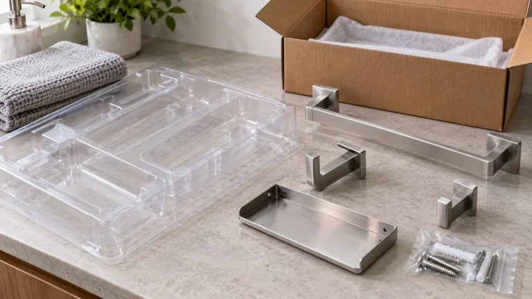
Review a folded sample or mock-up that represents the final construction. Confirm that the product fits and that packaging components do not scratch or deform the hardware. If the box includes printed assembly instructions or product identifiers, verify these against the approved content and language. Color approval should not distract from protection, traceability or shipping requirements.
Use a version-controlled artwork file and distinguish supplier prepress changes from buyer-approved design changes. A small technical adjustment may be required for trapping, registration or fold clearance, but it should be shown clearly and approved when it changes the visible result. Keep the approved PDF or artwork, proof image, physical sample ID and purchase-order reference connected.
Common packaging color approval problems
A screen image is treated as the final color master. Confirm the physical substrate and proof method, then approve an identified sample for production.
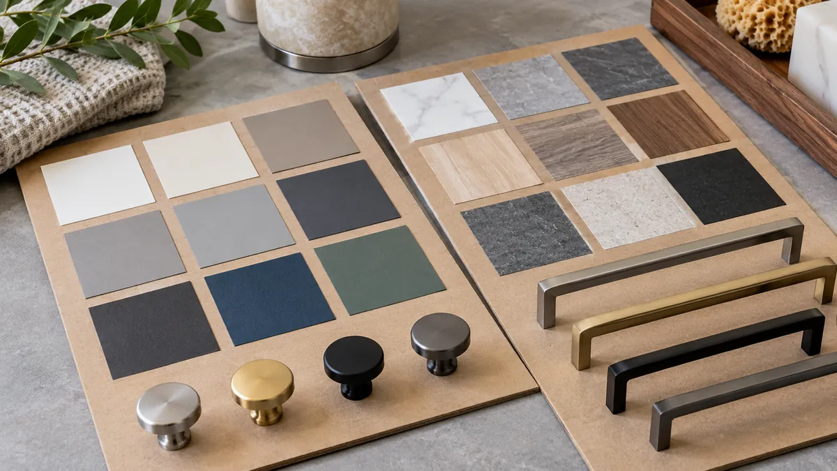
The color code is provided without the substrate. State board grade, surface and finish. A reference shown on one material may not match another visually.
The buyer and printer use different viewing light. Agree a consistent viewing condition for review and document any unresolved metameric appearance concern.
The approved proof is from an old artwork revision. Record file name, revision/date and final decision; invalidate superseded proofs.
Only a flat swatch is reviewed. Check the folded carton, large color fields, seams, print registration and product fit.
The quotation compares different print scopes. Normalize stock, dimensions, coverage, finishing, quantity and packing scope before comparing costs.
RFQ and approval questions for the carton supplier
Ask the supplier to recommend spot or process printing for the proposed artwork and explain why. Which colors are critical? What substrate and finish will be used? What proof type can be supplied, and how closely does it represent the production press and material? What are the relevant limitations? A carton printing spot color versus CMYK Pantone proof review should record these assumptions beside the approved reference. Request comparable pricing and lead-time assumptions for each proposed route.
Define the evidence to retain: approved artwork version, color reference, proof type, substrate, finish, approval date and decision owner. If a color measurement is part of the requirement, specify the instrument, measurement condition and acceptance approach with the supplier. If acceptance is visual, define the reference sample and viewing condition so two teams do not compare different standards.
For hardware cartons, tie the packaging proof to a production-intent product sample and pack-out. Confirm the product name, SKU or model, barcodes and any shipping marks against the order documentation. A correct color on an obsolete artwork file is not a successful packaging approval.
Koitor is a custom metal hardware manufacturer and can coordinate buyer packaging requirements within a product project. Printing capability, carton sourcing and print-route details should be confirmed with the responsible packaging supplier; this article does not claim Koitor owns a print facility or guarantees a particular color result.
Buyer proof approval checklist
- Identify the carton, artwork file and revision.
- Mark the brand-critical colors and areas.
- State spot or CMYK route, or request the supplier’s recommendation.
- Identify the board substrate, surface and finishing condition.
- Name the proof type and what production condition it represents.
- Review under a consistent viewing condition against an identified reference.
- Approve a folded carton and product pack-out, not only a flat swatch.
- Save the approval record, sample identity and final artwork version.
- Define how later changes to ink, stock, finish or artwork are controlled.
Frequently asked questions
Is a Pantone reference a guarantee of the printed carton color?
No. It communicates a color target, but the printed appearance depends on ink, substrate, surface, finishing and viewing conditions. Approve a representative physical proof and define the acceptance basis with the packaging supplier.
Is spot color always better for a brand logo?
Not in every case. A spot route may suit a limited palette, while process printing may be practical for complex artwork. Compare the actual artwork, print supplier method, quantity, substrate and cost before choosing.
Can a digital proof approve the color?
A digital proof is useful for layout and content but may not represent the physical print color. If color is critical, request a proof on the intended stock or another agreed production-representative sample.
What should a buyer keep after approval?
Retain the artwork revision, color reference, proof type, substrate and finish, approval owner/date, sample ID and any agreed deviations. Keep them linked to the purchase order and pack-out.
Conclusion: approve the print route on the real package
Spot and CMYK printing are different tools, not universal quality levels. Buyers should identify critical color areas, compare like-for-like production routes, approve a proof on representative material and verify the folded carton with the actual hardware pack-out. A carton printing spot color versus CMYK Pantone proof comparison should include the final substrate and coating when those affect the visible result. Keep artwork revisions and proof conditions traceable so production references remain unambiguous.
For a private-label hardware program, share the packaging artwork, product sample and shipping requirements early in the sourcing process. Learn about Koitor OEM home-storage hardware manufacturing or discuss packaging coordination through the contact page. Keep the approved print sample available for the next order and document any later change to stock, finish or artwork.
Plan a Private-Label Hardware Pack
Share your carton artwork revision, product sample and proof-approval needs for project coordination.
OEM / PRIVATE LABEL
Turn this sourcing guide into a product brief
Share your target product, size, finish, order quantity and packaging requirements. Your team receives a practical manufacturability review before quotation.
 English
  Español
  Português
  Français
  Deutsch
  العربية